
Top 10 Pokémon Designs: Gen. II
One Fan's Favorites, Part II
The first generation of Pokémon is probably the most nostalgic for a lot of people. Back then, things were a bit simpler. Battles were more straight forward, there weren't any crazy methods of catching or evolving wild Pokémon, and more importantly, there were only one hundred and fifty Pokémon to catch overall. But nothing as popular as this franchise was going to stay small forever, and thus, Gen. II was soon born, bringing with it a whole lot of new Pokémon - including a handful of pre-evolutions and evolutions for existing 'mons - and with them, some more awesome designs. As with anything, some people latched onto a handful when it came to the ones they liked most, while others were ridiculed or forgotten.
Either way, once more, my focus will be looking at and appreciating the ten Pokémon with the best designs by my own standards. Since I've already gone into the specifics with the previous article, I won't dilly-dally for too long, I'll simply bring up a simple reminder for anyone reading this who read the first part or who didn't: this is not a list that needs to be followed, and anyone can have their own opinions on what Pokémon they like best in terms of overall appearance. You're wrong, of course, but I won't dock you - too many - points for disagreeing with me.
Humor aside, let's just jump into the next Top 10 Pokémon with the best designs, specifically from Gen. II, the land of Johto. As a reminder, there are no legendaries, this list is focusing entirely on the Pokémon that you don't have to chase around to catch or bring 900 Ultra Balls for.
Let's begin.
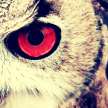
10. Noctowl
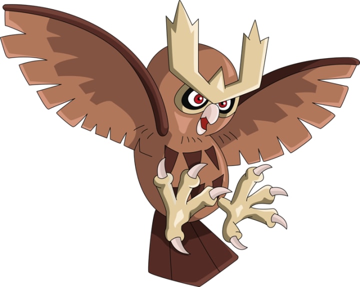
Bringing up the rear on this list is actually one of my favorite Pokémon of Gen. II, and perhaps one of my favorites of all the generations combined, Noctowl. However, despite being one of my personal favorites, I want to try and be somewhat fair, and just look at it based on its design.
Noctowl's design isn't anything extraordinary, which is the main reason why Noctowl is sitting at the 10 spot. I'm adding it due to my favoritism, but though I love Noctowl to pieces - as I am a huge fan of owls in general - I am also aware that I have to be somewhat smart when doing this. That said, I do really like its design. It isn't special when you compare it to the other Flying type Pokémon introduced, in particular the other two birds - one of which, spoilers, is on this list.
Its design as a whole is very basic. The most noteworthy thing about Noctowl besides its big, reddish-colored eyes, are its horns. It's a spin on the Great Horned Owl, except whereas with the real life version the horns are feathers, these appear to be actual horns coming off its forehead. I don't know about you, but that's pretty cool. I'd have to say, it kind of beats out the luxurious hair of Pidgeotto and Pidgeot any day, since it makes Noctowl look more threatening in appearance, rather than stylish.
Still, there isn't much else to really go over.
The patterns on its belly are a nice addition, giving it a bit more detail than the previous generation's bird Pokémon, and I can take it more seriously than the other birds before it, which helps, I suppose. But while it may have a more simplistic design, I still find it to be better-designed than a good chunk of the other Gen. II 'mons. I wouldn't say any of them are truly terrible, but Noctowl still wins out when compared to them, even though all Noctowl is is a cool owl with horns.
Sorry, Noctowl. I may love you, but, you're going to be stuck at the bottom of the barrel for this list.
9. Girafarig

If ever there was a Pokémon from Gen. II with a bizarre design, I'd have to say that Girafarig is the winner of that contest. I never would've expected a Pokémon based off a giraffe to wind up looking... like this. But here it is, and, well, let's talk about it, shall we?
Girafarig's design reminds me a lot of Doduo and Dodrio from Gen. I, and kind of like Dugtrio and Magneton. Except whereas Dugtrio and Magneton make sense - sort of - from an aesthetic view, and whereas you can kind of buy the whole Doduo and Dodrio having multiple heads thing, Girafarig's just feels so far out of left field, it's probably come from space by this point. I mean, it's a tiny-necked giraffe with a living snake for a tail. And possibly second head, that one I'm honestly still baffled on to this day.
But while I may be a bit confused when it comes to Girafarig's design, I cannot just idly sit by and not include it on a list dedicated to the Pokémon I feel have the best look. Because as strange as it is, this Pokémon's design is unabashed in its uncanniness and its uniqueness.
There's just something fascinating about its design. Girafarig looks like some sort of partial attempt at a chimera given the fact it's two animals fused together. And in doing so, it serves as a literal balance between something cute - look at those big eyes and that sweet face for the giraffe portion - and something both nightmarish and creepy - that black, snake, tail-face... thing. Seriously, I wouldn't know if I was supposed to pet it or run away from it, and I kind of like that fact. It's like the Pokémon equivalent of having eyes on the back of your head, or a living double-edged sword. I don't know how I'm supposed to feel with Girafarig, but in the end, I can't deny that its design is incredibly unique and interesting.
I think it best that I just move on. That tail... thing is starting to stare...
8. Scizor
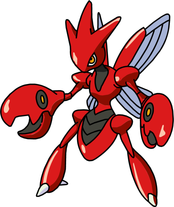
I have to admit, when I was first constructing my Top 10, I hadn't expected I would wind up picking the evolved form of a Pokémon that was featured in the previous Top 10 list. But, here we are, with Scyther's metal-themed evolution, Scizor.
In truth, if I had to pick which of the two I liked best aesthetically, I would have to say Scizor. And yet, if I had to choose one over the other just in general, I'd have to go with Scyther, just because Scyther's a little bit more appealing when I take all their qualities together. Still, Scizor is one of my favorite Steel type Pokémon from Gen. II, and with a single exception from Gen. II, my favorite Steel type of them all.
Scizor was one of the few newly introduced Steel type Pokémon brought in with Gen. II, besides Steelix, Forretress, a certain 'mon that won't be named for reasons, and the weird type retconning of Magnemite and Magneton. But of the lot presented to us, Scizor was the coolest by far. I mean, really, it takes the awesome, intimidating features of its pre-evolved form and enhances them by slapping a metallic coat of paint onto Scyther, not to mention changing its scythes into claws.
True, scythe-hands are more imposing, but I have to say, the metallic pincers are pretty damn awesome to look at.
Scizor's design is great. It looks close to Scyther, but with a few touch-ups that help show it's a stronger, more dangerous evolution. It went from a pale-ish green color to a sleek, metallic red, which alone really helps it pop out when you compare it to the other Steel types, who are all primarily gray. Scizor isn't, it's almost ostentatious with that bright red, and yet, it's still a badass design. The stoic expression and the shift from scythes to pincers is what does this, giving Scizor an edge to show that, yes, it's colorful, but no, it's not cute and cuddly, don't try to shake its hands.
Also, I really appreciate how much more pronounced the head spikes are, as they are yet another detail that gives Scizor its great look. Though part of me wonders how things would look if Scizor and Scyther were switched, and Scyther was the Steel type with scythes. Food for thought.
7. Ariados

Yes indeed, I've got two Bug types back-to-back, only this one isn't an evolution to a Bug type from Gen. I. Ariados is one of a small number of new Bug type Pokémon introduced, and is probably the best-looking one of the bunch, or at least, the coolest.
Ariados has a lot going for it when it comes to its design.
I mean, look at the thing. It has a red body with black stripes, the horn and fangs, the spikes on its behind, the dots on its backside that almost look like a face, and the two leg-like appendages growing out of its mid-back... Suffice to say, there is a remarkable amount of detail going on with Ariados, way more than the previous generation's Bug types by a long shot, and probably more than the other Bug types introduced in Gen. II. Fortunately, it never gets too busy with all the features on display, and everything creates a nice little package.
It just so happens that package is a poisonous spider.
That aside, the details are what give Ariados its rank on this list. It's amazing to me that there can be so much without causing too much clutter, and I really appreciate the fact that it works so well. Ariados gives off the vibe you would expect from a spider: danger. Those fangs and the horn alone are enough to make you want to be wary around it, and that isn't even taking the red-and-black combination, the spikes on its behind, or the fact that its backside has a face design on it.
It's one red flag after the other, and really, we're already talking about a mutant spider. Though to be fair, by the time you took in all the details and admired them in full, Ariados would've probably already bitten you with those poison-soaked fangs of it. Worst spider bite ever.
6. Skarmory
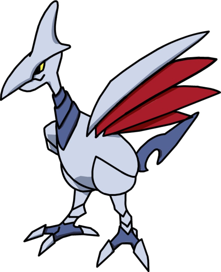
Whereas Noctowl from earlier and Pidgeotto from the previous Top 10 list were normal-looking birds with a few minor unique details that I liked, Skarmory is cut from an entirely different flock - a flock made out of sharp metal, to be more precise. And damn am I glad that it is, because Skarmory has to be the coolest bird Pokémon around, even cooler than Noctowl, one of my all-time favorites. That's telling.
Skarmory is a steel bird. With steel feathers. And a steel beak. And a steel everything.
That on its own is incredibly wicked, but when you take into account its general design, it just makes it so much more interesting (and yes, cool). From the razor-sharp talons to the razor-sharp wings to its razor-sharp tail, all the way to its razor-sharp beak-slash-head crest-thing, Skarmory might as well be a winged sword by this point with how pointy it is. But its pointiness is what gives it such an edge compared to the other bird Pokémon, and most Flying types in general.
It looks dangerous. Intimidating. Imposing.
The same words I've used and will continue to use to describe Pokémon that are not meant to be taken lightly. Skarmory kind of best encapsulates those words, however, because just look at the thing. Imagine something like that existing in today's world and how deadly it would be if you happened to come across one's nest or territory.
It is a literal living weapon, and every inch of it is capable of cutting, slashing, slicing, dicing, and probably cleaving parts of you off. In fact, the only thing I'm left wondering from its design is how in the hell can a trainer ride it comfortably if they use it to fly? Um, ow?
5. Espeon

No doubt it's becoming incredibly obvious by this point that I am a huge fan of the Eeeveelutions, since I had all three on the previous Top 10, and here's another. So yes, I will just state it: it's true. Anyways.
Espeon is not my favorite Eeveelution in terms of design, or really in terms of anything. But, when it comes to every Pokémon design from Gen. II, Espeon's has probably grown on me the most, which is one of the reasons why it's this high up on my list.
There's something almost ethereal about Espeon. Its slender figure, the forked tail - a nice little shout out to a Nekomata, if I do say so - and the fact that, aesthetically, there isn't a whole lot going on, gives it a strange visage when you compare it to the other Eeveelutions. Its most striking features would have to be a toss up between its eyes and the little red gem on its forehead. Its ears have an interesting look, sure, but Espeon's eyes and the gem are much more noticeable and much more interesting.
These details give Espeon a level of eerieness that winds up being shockingly fitting for a Psychic type. There's nothing in-your-face about them details, but you can still tell that Espeon is a Psychic type, much like how you can tell what types the other Eeveelutions are. In terms of aesthetic, it has even less going on than Flareon, and Flareon was, for me, the most subtle of the original three Eeveelutions.
But, I like it. It gives Espeon an air of mysticism, and there aren't any extraneous things going on with its design to distract the eye. It isn't wasting time with flashiness or gaudiness, it is simple, yet also elegant. Thus, on a design level, it works out perfectly, and it illustrates the fact that Espeon focuses more on its mind than it does its body. Fitting.
4. Typhlosion
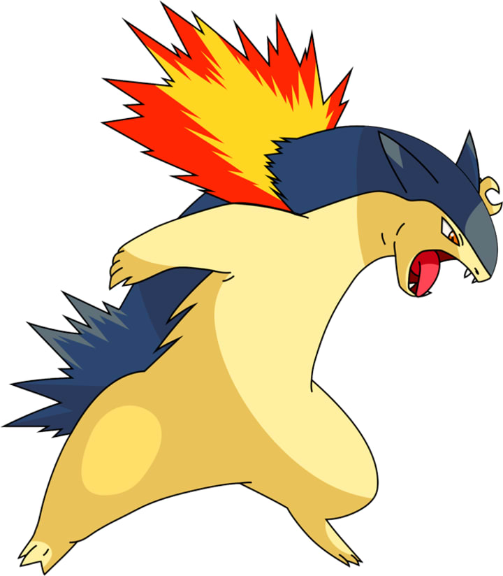
You know, for the longest time, I never knew that Typhlosion was meant to be based off a honey badger. I honestly never knew what animal it was meant to be, and that's probably because it doesn't look very much like a badger, nor do its previous evolutions. The only reason I came to the conclusion it's a honey badger is based on a Youtube video I watched that said it.
And we all know Youtube would never lie, right?
At any rate, Typhlosion is in the same boat as Blastoise from the previous Top 10 list, in that I love the design for all three of its evolutions, and it's my favorite of the Gen. II starters by a landslide. Even though I never knew what the hell animal it was supposed to be, I never let that dissuade me from choosing it as my starter, a decision I have yet to regret. All three have good designs that separate them from Gen. I's Fire starter, and again, like with Blastoise, Typhlosion is my favorite of the three.
For one thing, I like that the flames on its body are used differently than just having its tail on fire or having a stream of fire coming off its body somewhere. The flames coming out of its neck create an interesting image, because it's a design I've never seen before. And, it makes Typhlosion look like a badass, because who in their right mind would want to fight something that looks like this plus the fiery neck mane? Besides, I feel if they had given it fire somewhere else, it would've muddied up the design too much. This way, the fire is less in your face, and yet, it still does the job it's meant to do letting you know it's a Fire type. And awesome.
I also feel that the fact I had no clue what it was before had a bit of an impact on me. It made it so that I didn't see Typhlosion as a Fire version of some animal, but rather, I was able to see Typhlosion as a walking, angry ball of flame that could explode at any given second, and would tear into my foes with little to no hesitation. It was pretty sweet, quite frankly, and even though I know now that it's based off a badger, that doesn't really change the impact its design had on me when I first saw it.
Other than its flaming neck fur, Typhlosion doesn't have much with its aesthetic. It's imposing to look at, sure, what with its bulky form, and meaner-looking face and sharp teeth, but if you took away the flames, would it still be as visually interesting? Compared to the other starters, I'm not entirely sure it would matter, but when you look at the other Fire types, then yes, I would have to say it wouldn't be as interesting. That is probably why Typhlosion is lower-ranking on this list, despite being sharing the same spot with Blastoise as my favorite starter.
3. Umbreon

It should come at no surprise by this point that Umbreon is on this list, especially given the fact that I just admitted in a previous entry that I love the Eeveelutions so much. And it's only fair that I give it to you straight: Umbreon is my absolute favorite of the whole bunch.
Umbreon's design is both fitting for a Dark type Eeveelution, and also incredible despite there not being a whole lot, much like Espeon. But whereas Espeon's design was simple in an elegant sort of way, Umbreon's is simple in a way that, quite frankly, is just plain cool. Its black fur is nice and attention grabbing, but more than that, the two biggest and best parts of its design are the red eyes and the yellow moon-like patterns on its fur.
Umbreon's red eyes are definitely noticeable, especially when you compare the eyes to the other Eeveelutions. It's a far cry from the cute little ball of fluff that is Eevee, and it's darker, potentially more sinister, compared to the eyes of its counterparts, especially Espeon. It adds a layer of menace to Umbreon, which is exemplified even further by the fact that even though Umbreon is a Dark type, its expression is practically neutral. You can hardly see its mouth due to the dark fur, but the eyes are in a stoic expression, much like Espeon's. But whereas Espeon's were more ethereal and mystic, Umbreon's are dark and foreboding. Ominous, almost.
The moon-like patterns just add onto this. I will say that I kind of like the powder-blue color that the shiny version of Umbreon has more than the yellow, but even so, the yellow works just as well.
Umbreon's design is why I love it more than the other Eeveelutions. It's dark and threatening, yet it isn't some despicable or wicked-looking Pokémon. Its dark qualities are more muted, almost somber, and that tone speaks to me. Maybe that's why I like Umbreon the most; we're both dark, somber creatures of the night. Or something like that.
2. Donphan

Donphan is similar to Noctowl when it comes to Pokémon I outright love everything about. It doesn't have the same amount of love I give Noctowl - elephants are cool, sure, but not my favorite animal around - but that doesn't take away how much I like this pachyderm Pokémon.
So then why, you may be wondering, is Donphan so high on the list, while Noctowl is at the very bottom if I like them both about the same? The answer is in their designs: Donphan's design is more visually interesting than Noctowl's.
Donphan's most distinguishable characteristic is its plate-like armor. It covers all of Donphan's back, its ears, and its trunk, creating a rather striking image of an armored elephant that honestly looks like it has the power to bulldoze through anything that happens to be standing in front of it. Not only that, but it's done away with the cuteness of its pre-evolved form, Phanpy. Phanpy is an adorable blue elephant. Donphan is a miniature tank. Its got fully grown tusks, and a demeanor that matches the armor it's gained, and that is why I love its design so much.
And really, Donphan's design isn't all that complex.
It's remarkably simplistic when you think about it, and yet, it makes the Pokémon. Imagine it without the armored plating on its body. It would look like a bigger, older, darker-hued Phanpy, which wouldn't have been bad, but it wouldn't have been anywhere near as interesting or eye-catching. Instead, the armor makes Donphan appear more serious, and it works from an evolutionary standpoint by showing how much tougher it's become. It helps prevent Donphan from being generic or bland-looking, and I feel like that's where the strength in its design shines the best.
Also, I have to say, I love those little armor-plate wrist-bands it's got going on. They almost feel out of place given the fact that the rest of its armor is one continuous thing, but at the same time, it just makes the look even more badass, and Donphan comes off looking even tougher, too. Win-win.
1. Houndoom

Coming in at the number 1 spot for the Johto region's Pokémon, Houndoom holds the special privilege of having my favorite design, which doesn't really amount to much outside of being number 1 on some random internet writer's article.
But, I'm sure Houndoom would be thrilled. I sure am.
Houndoom is probably one of the most striking Pokémon from Gen. II when it comes to designs. You can tell right away that it's meant to be based on a hellhound, or at least Game Freak's take on a hellhound in a game series that's meant to be kid-friendly. But dang, they did not pull punches in making Houndoom look like something out of the fiery pits, that much is for certain, and I couldn't be happier with the end result.
The bone-like ridges - is that armor, I wonder? - on its back and neck, as well as the horns pointing back on its forehead are its most distinguishing characteristics, although the jet black fur and dark underbelly doesn't hurt, either. And yes, the devil-like pointed tail is also a nice touch. These design elements make a statement about its nature, but at the same time, it doesn't go overboard. It's the way a good design is meant to work for a Pokémon.
Plus, let's face it, this Pokémon looks like something that would pop out of a portal during a Satanic ritual with glowing red eyes, a frothing mouth, and flames surrounding it, which is almost exactly what it does anyways, sans the frothing.
On a more serious note, I really do love Houndoom's design, as if that weren't already obvious. It's the most badass-looking addition to the Pokémon realm from Gen. II, maybe even the most badass-looking from the first two generations combined. Some come close, sure, but Houndoom leaves an impact with its appearance. It's the first Dark/Fire type (alongside with Houndour, its pre-evolution), and its sleek-yet-threatening form really sells that. It looks like the kind of creature you don't want to come across in a dark alley at night, or ever, for that matter.
The only thing that baffles me is... It has horns, but it never learns any moves that involve using its horns to its advantage. What gives, Game Freak? Well, while I ponder the answer to that question, I suppose it's for the best I move onto bigger, better things.
Next stop: the Hoenn 'mons.
About the Creator
D.A. Baldwin
I am currently a student at a university, trying to find my way in life, while also trying to write a book. Lots of ideas bouncing in my head for potential articles, so we'll see how that goes. Cheers!
Keep reading
More stories from D.A. Baldwin and writers in Geeks and other communities.
Top 10 Pokémon Designs: Gen. I
When it comes to Pokémon, there are a lot of things to enjoy. Whether you're a fan of the video games, a fan of the anime and its various movies, a fan of its manga, or you just like the concept and enjoy creating your own Pokémon and adventures, there is so much that this franchise brings to the table in terms of entertainment. It's one of the reasons I believe that Pokémon is so immensely popular, and it holds true for me, since I've been a fan of the franchise for over twenty-plus years. True, it has its flaws - as with any series - but those are usually easy to look past when you're spending hours on end trying to capture that legendary, or when you just got done binge-watching an entire season.
By D.A. Baldwin7 years ago in Geeks
5 Feelgood Stories Of Kids In The Entertainment Industry
Viewers everywhere are still reeling from the horrifying revelations in the recent documentary Quiet On Set: The Dark Side of Kids' TV. The depth of Producer Dan Schneider's inappropriate behaviour around the sets of his Nickelodeon TV shows is apalling, even more so the series of missed warnings and adult failures that led to then-child star Drake Bell's sexual abuse at the hands of his acting coach, Brian Peck.
By Kristy Anderson20 days ago in Geeks
Palm Royale Pilot episode
We are taken to Palm Beach in 1969, home to the prestigious Palm Royale. Maxine tries to seamlessly include herself in the Palm Royale by taking the "back door" and joining a conversation with the 4 ruling ladies. Evelyn Rollins (Allison Janey), Dinah Donahue (Leslie Bibb), Raquel Kimberly-Marco(Claudia Ferri), and Mary Jones Davidsoul(Julia Duffy) are the influential ladies.
By 'Vive Akugha5 days ago in Geeks

Comments
There are no comments for this story
Be the first to respond and start the conversation.