
Early Concept Art Of Jared Leto In 'Suicide Squad' Shows The Joker As Less Gangster And More Showman
'Suicide Squad' concept art of Jared Leto's Joker was released with some interesting views of the character.

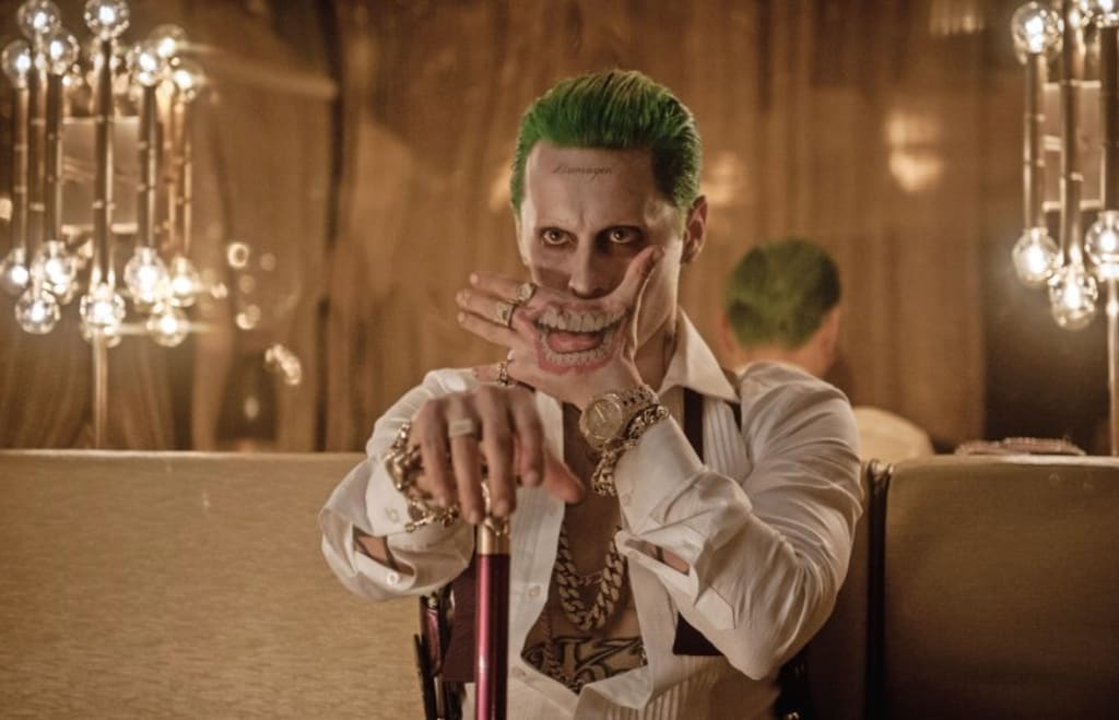
The Suicide Squad audience tends to be torn over the movie, whether or not it was any good, if certain characters should've been given more screen time, and whether or not there was enough Joker or if we got too much of something that was a little over the top as far as #JaredLeto's Joker went. Most fans went into it expecting a Joker-centric film, but what we got instead was about five minutes of the Joker in the midst of a lot of crazy antics and a villain that ended up a bit sub-par after certain scenes were removed.
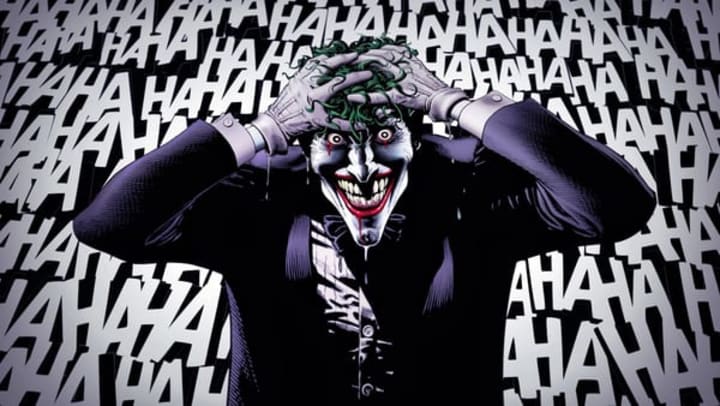
The controversy about the #Joker started early on, namely about the strange new look for the character that had fans up in arms. When the first image was released online, many fans immediately started bashing it, as well as creating parody photos.
But as with all character designs, the final design wasn't the first one and there were various version of the character that ultimately got scrapped. Tina Charad, the graphic costume designer/illustrator for the movie, just released some of her early concept art, and, well...it could have been weirder — a lot weirder, as it turns out.
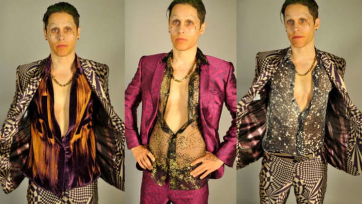
Leto's Joker did make some, uh, interesting fashion choices in the film, including many scenes with no shirt on under his jacket. But it seemed that his initial design was much more flamboyant, a little less street criminal and a little more Liberace with glitter and clashing patterns.
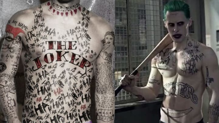
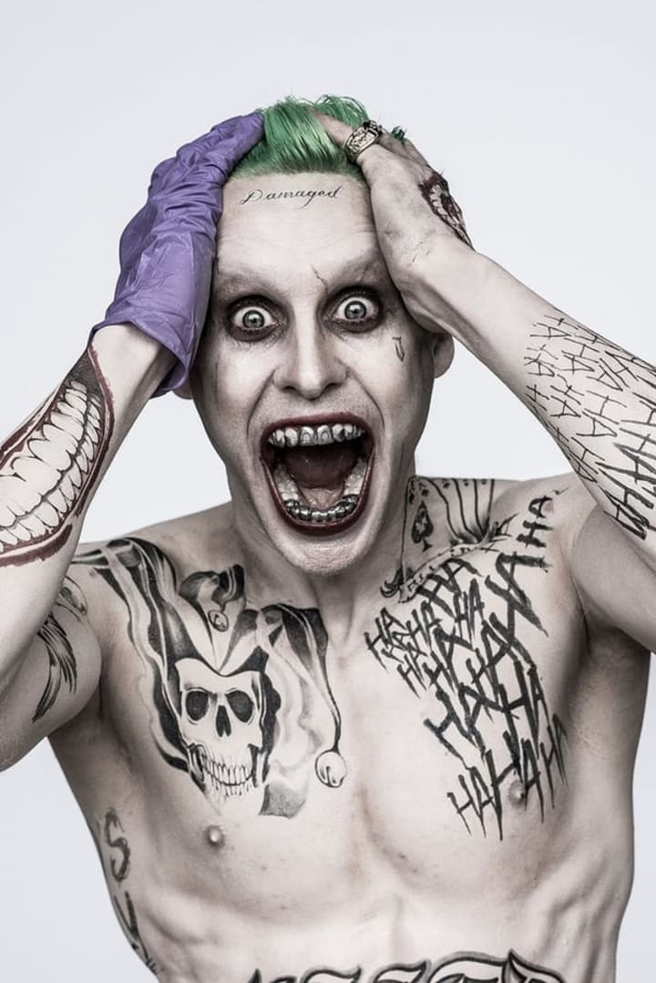
His tattoos were originally much more over-the-top as well, with far too many "ha-ha-ha"s as a nod to The Killing Joke graphic novel.
It is interesting, however, to see the color scheme of his original tattoos, which is much more Harley Quinn than the Joker, with the red and black as well as the lettering font on his actual name. Although it is kind of nice to see her represented there on his shoulder, something tells me that she had a hand in his tattoos, which clearly has to do with the whole early storylines of her having a tattoo parlor that was ultimately mostly scrapped. It's also worth nothing the teeth that Batman knocked out of him represented on his neck — definitely an intriguing touch.

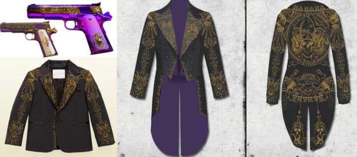
Judging from the last few designs above, it seems clear they were looking to go with a strong purple-and-gold color scheme for Joker at one point, too. And, apparently, more of a vaudeville circus ringmaster look.
Given how many fans thought that his acting and looks were a little much, I can see why they decided to change the look to a slightly simpler design, though it would have been interesting to see these outfits on screen. Perhaps they will show up the next time the Joker does, maybe in the solo #HarleyQuinn film? We'll see.

[Source: Gizmodo]
About the Creator
Tisha Eaton
I am a Disney Fanatic who loves to give information on stars, movies and shows that you guys like too! A professional fan girl who has been featured on Huffington Post and loves to share her love of anything and everything
Keep reading
More stories from Tisha Eaton and writers in Geeks and other communities.
VP-Elect Mike Pence Gets A Stern Talking To By The Cast Of 'Hamilton' And The Internet Reacts
#Hamilton is one the hottest tickets on #Broadway right now (maybe ever), with sold out performances for months. Vice President elect Mike Pence just assumed that he would have a quiet night out at the theater when he caught a performance of the show, but he thought wrong. Instead, he was roundly booed when the audience realized he was there. The play has a diverse cast, portraying American history in an raw and unique way, and they took the opportunity to call out Pence in the most polite way possible that they hope he will be better in the future about being a Vice President for all Americans, not just the ones who hold his same beliefs.
By Tisha Eaton6 years ago in Geeks
The Pearl by John Steinbeck
‘The Pearl’ is a well-known by under-read classic and, as a teacher, many of my students have absolutely loved it. Not just because it is short, but because it presents a storyline that is interesting and corrupting. Easy to read and easier to analyse, ‘The Pearl’ is one of Steinbeck’s hardest hitting classics with an underlying message about protecting what is actually important. By the end of the book, the reader is left defeated and believing in the wrong thing. The idealism around this book is incredible and it is so dark too. For a long while you are supporting the wrong people, thinking in the wrong way and the whole story becomes one long act of misdirection by Steinbeck to show in a ‘Monkey’s Paw’ fashion why we should never chase wealth and status.
By Annie Kapur19 days ago in Geeks
Bade Miyan Chote Miyan Ending Explained: Never underestimate AI
Guys, Elon Musk had said some time ago that AI is far more dangerous than nukes. On this issue, Bollywood has brought a film called Bade Miyan Chote Miyan, in whose star cast we have Akshay Kumar, Tiger Shroff, Prithviraj Sukumaran, Manushi Chillar, and Sonakshi Sinha. All this is being seen.
By Ayush Verma4 days ago in Geeks


Comments
There are no comments for this story
Be the first to respond and start the conversation.